Stationery used to be mandatory. As we’ve stopped needing paper quite so much, it’s inherently become more novel, and using it is more of a choice than a chore.
Like board games, stationery’s position on a form/function spectrum is well-balanced. There’s plenty of room for artistic autonomy, but the product still has to perform its job. Unlike with fine art, there are strict parameters here. These restrictions force designers to make decisions, which in turn shed light on thought processes, priorities.
There’s something magical in an item that’s useful, necessary, and expressive. It begs to be Had Fun With.
Across eras and geography, people have seen the possibilities in paper. Here are some examples from my collection; this little group highlights paper’s capacity for whimsy & joy, not just beauty.
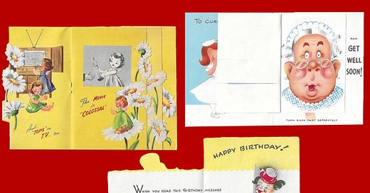
These cards play with paper’s dynamic nature and moldable form. The top left operates like a book, with several pages layered on top of one another, while the top right card allows the recipient to create their own mix-and-match person. They’re interactive, intended to spark excitement and laughter.
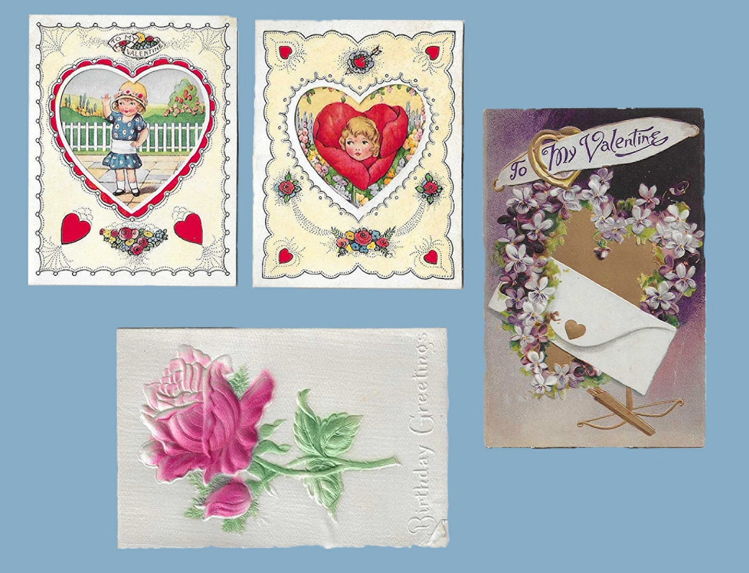
Shiny, textured, layered, romantic cards; this group is an exercise in daintiness. The leftmost Valentines are a tad 3D, as the hearts are cutouts and open to reveal a larger picture. I’ve scaled all four similarly here, but those first two are about palm-sized in real life, which makes each detail even finer. The other two cards are embossed and have an almost fabric-like texture, particularly the birthday rose. The artists’ hands are visible, and loving.
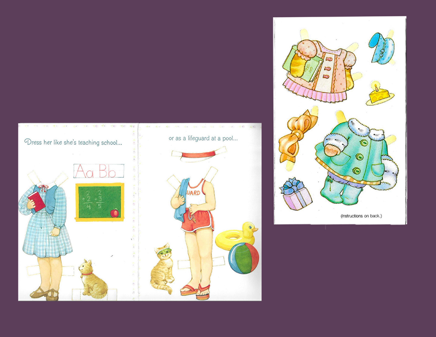
A toy & card, in one. Useful, compact, and intricate, these two play with the ephemerality of card-giving and acknowledge what interests children. What means more to the giver: their letter remaining intact but perhaps discarded, or its being dismantled and used? These cards sacrifice themselves in the name of delight, and in doing so blaspheme the notion that a card’s inherent purpose is to be unmarred, treasured all in one piece.
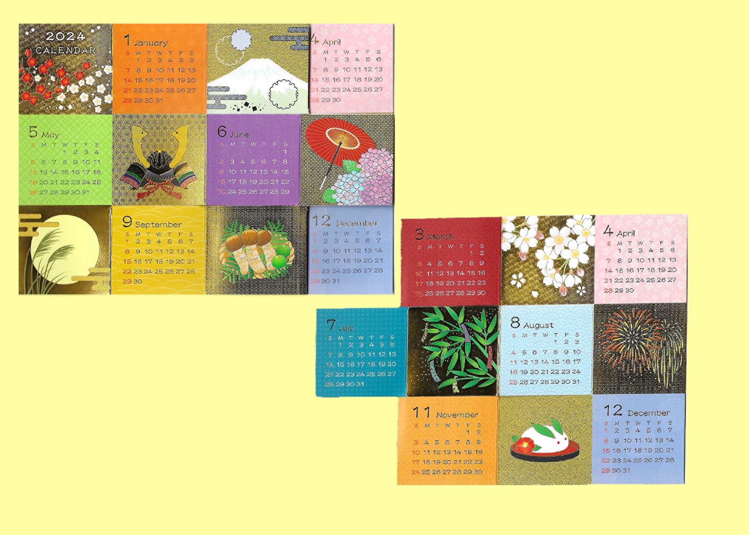
I bought this calendar in Japan; it folds out like an accordion and stands up on its own. It’s shiny, small, and lovely. It eschews calendars’ usual notepad-ish, vertical format and presents the months all at once. The year becomes less daunting when it’s so small. And because there’s no room to add personal events, the calendar serves as a comforting statement: the year just is. January will come, then February, then March.
I love you I love you, bye!

